La Guardia Airport

Posted: April 20, 2011 in Uncategorized

I decided to visit La Guardia Airport for the assignment of this module. It is incredible the application of Way finding and Interaction Design I saw. Let’s take a look.

This is entrance of the US Airways Terminal. The arrows, the symbols and the text give us a choice to reach our destination according to our needs. It is very concise. The use of black text against yellow background brings me attention to it.

I am still outside the airport. We see the big signage on top. Pointing to the arrivals.

Here it is another signage. This is where I took the bus. I had four options: one going to Manhattan via M60 and the other three going to Queens, Q33, Q48 and Q72. I took Q33 to get back home in 10 minutes. The different dot colors below the public buses sign indicate you may transfer to different trains also.


T
his map showed me where I was exactly. Again it also shows what buses you may take from there to Manhattan and or Queens. You also see the trains to make transfer to.

Inside the airport, the green signal directs people to taking a cab. I know it is empty. It was last sunday.

We see the big sign on top to claim baggage. As I continue to walk that way, I found more directions towards it. There was no sign that directed me that way.

Here I found the Visitor Information machine that allowed me to interact with it. It was very easy to do so. I had many options to choose from.

Here is a better close up of this machine. We see the many options we had at our convenience. I must admit it was very user friendly.


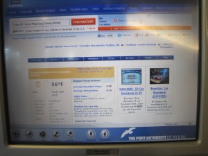
I pressed Whether to see how it works.


Here you are the display after I pressed it. See the whether temperature to your left: 56 F. 

This phone can provide customer to some information according to the options below. Signage and Interaction (phone) applied here.

The green sign shows to Rental Car along with the car sign in black. It is really hard to miss. We see a welcome display to La Guardia Airport.

I really enjoyed my trip to La Guardia Airport LGA. I must admit the usage of way finding were not difficult. I followed them and it made my trip very pleasant. This airport is not that big but, it is easy to reach your destiny whatever that may be. 

Information Tool: VoiceThread

Posted: April 8, 2011 in Uncategorized

I used the information design tool called VoiceThread for this module. I used this tool in a previous class. I really enjoy the features from this program. It is a free site. I meant to use this tool for the previous module but, I wanted to do something different (Mapping Applications) so I decided to save the best for last.

You may upload your pictures and arrange them and or lay them out at your best convenience. This tool enables you to use audio and text also. The audience may feel like engaging to this program due to the interactivity provided. The audience may give their input at any time. This program works like a slide show of pictures. As I stated before, the audience may leave their comments as many as they want using text and or audio at the end of the particular picture displayed . As well as at the end of the slide show. I think it is a great interactive tool. People can give you a feedback so that would help the designer improve his work. Also, it is so easy to update.

I used this tool to tell my audience (my classmates) about my unforgettable experience visiting Machu Picchu located in Cusco, Peru. The experience is unique and overwhelm. I took many pictures but, I did not want my audience to be overwhelmed by it. So, I used a few of them and with the help of the interactivity of this tool, I explain some details of the pictures displayed. If you ever get a chance to go there, you will not regret it. I even felt like staying to live there. I hope you enjoy. I am having problems with the link below. Please copy and paste it to your browser. Sorry for the inconvenience.

http://voicethread.com/share/1871207/

Mapping Applications

Posted: March 25, 2011 in Uncategorized

There is a variety of design tools to display Information Design like Social Media, Mapping Applications, 3D virtual worlds etc.

Mapping Application applies to one of the six ways of seeing and showing also: WHERE.

One of the well known Mapping Applications is Google Map for instance. Google is one of the most trusted search engines in the world. Everyone is fully aware of the excellence service provided including its mapping service.

Google Maps has a wide global coverage which is second to none of the other web-mapping services. It also facilitates its users to create their own profile. Google Map has an international look which is suitable to users of any region.

It can be used for searching addresses, roads and intersections, cities, towns, Business regions, coordinates, geographical features, user created contents, driving directions etc.

The maps provide detailed and relevant information to its users regarding places of their interest. Maps available on this site are extremely reliable and accurate. Google Maps has the comprehensive coverage of various significant locations across the globe. Even the tiniest location can be cited subject to its importance among people.

I am going to Giant Stadium this Saturday. I’ve never been there before. I used Google Map to find out how to get there in no time. I have all the information I needed for my little trip. Directions are easy to follow. I know how long it is going to take me to get there either by car or by train.

Art is about self-expression, Design is self less. – Jeff Harris.

They are the steps to be followed by brainstorming, collaborating and organizing data. It is the execution of tasks to accomplish a well detail design that can fulfill the requirements of reaching the audience based on the business strategy of the client. Even though neither there is no set nor a unique rule to accomplish the goal.

Information Design Process is divided as it follows:

  • Discovery
  • Content/Analysis
  • Personas and Scenarios
  • Testing

Discovery: It is vital to get acquainted with the client as much as possible. It is important to find out the client’s previous projects. Since most designs are very much related to the client’s background. It is also a must to make and maintain good alleys within the client organization so; the designing team may feel very comfortable getting the proper information that will enable them to develop the right project according to the client’s audience needs.

This is the first step to developing a design and probably the most important. It is unlikely to come up with a good plan when the designing team ignores completely that client organization they will be working with. Once a plan such an outline acknowledging the role and responsibility of each member of them is in develop, it is easier to maintain a direction towards a particular goal. In other words, it is the foundation to the process of Information Design

Content/ Analysis: This is a very crucial step. Design and content continually inform each other. If possible, a designer must help the client come up with the right content. It is not unlikely for Information Designer to be part of developing content. Some clients bring their own content however; if the Designer has a problem reading it and or trying to understand, there is a good chance the audience may do as well.

Once the designer receives the data, the solution to the problem begins to develop. The designer must ensure the tone of the content is the appropriate one to reach the audience. It is common to use plain language which will benefit the readers of the content. Plain Language is displayed in short sentences. It is easy an effective way to communicate ideas to the audience. It is also important to review the content. A designer may try to compare it to the competition’s content. It may help to analyze previous projects developed for the client. A designer must analyze what the goal is and what to archive.

Creative Brief will ensure everyone is on the same page that includes not only the designing team but the client’s one as well. Creative Brief will help the designing team come up with new ideas that will make the developing process smooth.

Personas and Scenarios: I think this is an essential part of the process.  Personas are fictional. In other words, it is the creation of a user profile that has desires, needs, habits and capabilities. It is a must to target an audience before putting it into practice. This will give the designer the power to acknowledge the audience needs.

Creating personas is a difficult process. It requires detailed process and validation. The designer needs to define his main audience. Then, create short list of specifications for the audience type. For example, age, gender, profession, education and such. Personas can be very useful when it comes to choosing the right designing approach.

Scenarios are detailed descriptions of what the site will do from the user’s perspective. Scenarios help you to identify specific ways how users interact with information design.

It could be a scenario how users interact with a specific web site. Scenarios could be specific or brief depending on complexity of the project.

Testing: Apparently, this should be the last part of the process. However; it is encouraged to test early in the process to avoid pitfalls that may arise at the end of the process. It is must to make the client understand that testing is part of the process. Testing is going to save money and time in a long run. Prototypes such a site map and blueprint are two of the structural overviews. Site map is the architectural development of the design such as website, brochure etc. Blueprint is likely to be the content to be displayed on the design. It is ok to test the site map and or the blueprint. It shouldn’t be a surprise to come up with new fresh arrangement of the design and or developing new ideas. It is usually ok to test unlikely and new approaches. Prototypes must look enough to the final project. It is a challenge to find the right balance so the testers may not confuse it with the final look and feel project. The client will provide people to test the prototypes also.

Conclusion: Every step in the process of Information Design is very important. The process varies according to the design project since every project is different. I think the first part of the process, Discovery and or getting to know the client’s organization is the foundation to develop a strategy and or plan to satisfy the client goals.

Ignoring the client’s business may unable designers to prepare a plan. Without a plan, it is really difficult to develop a good design. One may end up putting all effort towards the wrong direction.  It is a waste of time and money. Let’s remember that this type of work is based on tight deadlines and budget. If there is no plan, it is even harder to find out where the content will be placed and so on. How would anyone find any job if he doesn’t know where apply? How would you know what your career path is if you don’t know what you want to be?

Discovery will give designers the push and or the inspiration they may need to go on in a project.

FYI, here is a Website Process Design.

Sources: Baer, Kim. Information Design Workbook: Graphic Approaches, Solutions, and Inspirations + 30 Case Studies. Rockport Pub, 2010. Print.

Interaction Design

Posted: February 12, 2011 in Uncategorized

“Interaction Design is the human-machine interaction based on the design of the interface during the execution of a task”. Interaction Design may be a new field in using digital media technologies to reach different audiences however; we have seen lately the variety of interaction design overwhelming us, for instance the emerging of video games. There are many types of video games according to the age of children. Video Games are very much related to storytelling. Interaction Designers must ensure the audience in this case children are engaged to the story. Designers should not create the video games that are neither too easy nor too difficult for them. Some video games even offer some rewards so the audience feel like they are recognized for their efforts.

Interface metaphors

 Interface designed to be similar to a physical entity but also has own properties e.g. desktop metaphor, web portals can be based on activity, object or a combination of both

Exploit user’s familiar knowledge, helping them to understand ‘the unfamiliar’

Benefits of interface metaphors

  1.  It makes learning new systems easier
  2.  Helps users understand the underlying conceptual model
  3.  They can be very innovative and enable the realm of computers and their applications to be made more accessible to a greater diversity of users

Problems

  1. Break conventional and cultural rules e.g. recycle bin placed on desktop
  2.  It can constrain designers in the way they conceptualize a problem space
  3.  Conflict with design principles
  4.  Forces users to only understand the system in terms of the metaphor
  5.  Designers can inadvertently use bad existing designs and transfer the bad parts over
  6.  Limits designers’ imagination in coming up with new conceptual models

I found this link about what the future might hold for Interaction Design. Please see the video at the top of the page.

http://www.interactiondesignblog.com/2009/11/the-future-of-microsoft-or-stupidity/

Here is another example, This is a Flash-based interface that lets you choose dates, pick rooms, and submit payment information all on one-screen.

broadmoor

I consider GPS devices also part of Interaction Design since we must interact with it in order to reach our destiny.

_____________________________________________________________________

Information Design implemented to the blog environment:

The theory of Information Design can definitely be applied to any field including the blog environment. We can easily find many blogs according to the topics we seek for. I am already applying different elements of Information Design on my blog such as planning, organizing, presenting my thoughts and theories clearly according to the topic chosen.

I am trying to be as concise as possible so my audience, my classmates would not have issues understanding my point of view and at the same time, their feedback would be very helpful as well.

The World of Information Design

Posted: January 19, 2011 in Uncategorized

What is Information Design?
There are many concepts regarding Information Design for instance, It’s the gathering and structure data and deliver it to the user effectively and properly. It could also be the concept and or the plan to develop accurate data to the user in a timely and easy manner.
Information Design is still a work in progress profession due in part from the different professional concepts of it. There are other professionals who have their own concept of Information Design. There is still no unique concept. professionals from other fields called it by other names as well.
The overwhelming amount of data we gain from the world of computers and or the real world pushed us to finding a way to deliver proper information. In order to communicate effectively and to meet people’s variety of interests, Information Design can accomplish that goal.
Information Design is on its way to become a new language that will emerge in the 21st Century. I think in order to deliver the proper information to the right people at the right time, we must count every detail possible. Information Design’s mission is improving the deficiencies of visual communication.
Information Design focuses on planning a way to ensure the user get the information they really required. There cannot be a unique form of delivering information, since we face different kinds of people.
Information Design also faces some tensions between Graphic Designers and Technical Communicators, while Designers are accustomed to creative “unique” and undisputed type of work, Technical people are more interested in simplicity rather than self-expression.
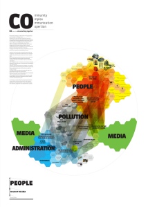
Here you are some samples of Information Design by Graphic Designers and Technical Communicators